
Forum
»
2012 - something happened (pic)
- Results 1 to 11 of 11
-
Page 1 of 1
Thread: 2012 - something happened (pic)
 08-19-2020, 12:25 PM
-
#1
- triception
- Premium
-

- triception
- Premium
- Join Date: Aug 2011
- Posts: 3,806
- Rep Power: 20368
-
-

2012 - something happened (pic)
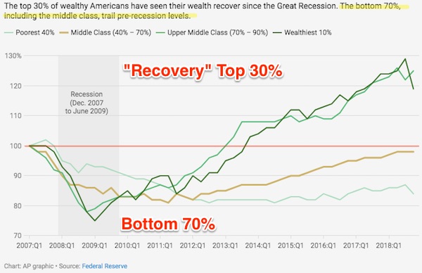
Look at where the wealth inequality post 2008 recession started taking off. Higher wealth inequality = less happy citizens across the entire income range
Green Tea Crew
Meditation Crew
LaCroix Crew
08-19-2020, 12:29 PM
-
#2
- thenightskies
- chocolate rain
-

- thenightskies
- chocolate rain
- Join Date: Sep 2011
- Age: 38
- Posts: 4,646
- Rep Power: 8582
-
-
ya the rich started to recover from the great recession
08-19-2020, 12:31 PM
-
#3
 08-19-2020, 12:39 PM
-
#4
 08-19-2020, 12:49 PM
-
#5
 08-19-2020, 12:50 PM
-
#6
 08-19-2020, 12:51 PM
-
#7
- armyr0b
- Registered User
-

- armyr0b
- Registered User
- Join Date: Jan 2008
- Location: Connecticut, United States
- Age: 46
- Posts: 6,321
- Rep Power: 21214
-
-
Originally Posted By triception⏩
Look at where the wealth inequality post 2008 recession started taking off. Higher wealth inequality = less happy citizens across the entire income range
this is most likely to due to the digital explosion. Around that time technological capabilities skyrocketed. smart phones, tablets, wireless, all of it just blew up and expanded rapidly. this created a bunch of new companies and sky rocketed a bunch of existing companies. those two lines were probably investors.Look at where the wealth inequality post 2008 recession started taking off. Higher wealth inequality = less happy citizens across the entire income range
PS4
New England Patriots
08-19-2020, 12:53 PM
-
#8
- Ironmanlet
- Adamantium User
-

- Ironmanlet
- Adamantium User
- Join Date: Aug 2009
- Location: Cajun Country
- Age: 40
- Height: 5'7"
- Weight: 185 lbs
- Posts: 52,716
- Subscribers: 6
- Rep Power: 419660
-
-

So this is probably just a potato oversight on my part, but I’m having an issue interpreting the chart.
The numbers on the y axis seem to designate a percentage of the population. How does that go above 100%? Because 100% is the entire population. I’m just doing something wrong in my brain...
Edit: the more I look at it, the more I think it isn’t my error.
Why didn’t they start at 0% instead of 70%, and go to 100% instead of 130%? Any basic stats course would suggest this is done to intentionally mislead the person/people interpreting the graph.
The numbers on the y axis seem to designate a percentage of the population. How does that go above 100%? Because 100% is the entire population. I’m just doing something wrong in my brain...
Edit: the more I look at it, the more I think it isn’t my error.
Why didn’t they start at 0% instead of 70%, and go to 100% instead of 130%? Any basic stats course would suggest this is done to intentionally mislead the person/people interpreting the graph.
“The stories and information posted here are artistic works of fiction and falsehood. Only a fool would take anything posted here as fact.“
PS: Don't eat poop, just don't let the idea of it stop you from living life to its fullest.
08-19-2020, 12:57 PM
-
#9
- NuggzTheNinja
- Exotic Game Hunter
-

- NuggzTheNinja
- Exotic Game Hunter
- Join Date: Oct 2004
- Posts: 31,871
- Rep Power: 237953
-
-
Thanks Obama.
This account was created for the purpose of roleplaying and satire. All posts, messages, images, or other media produced by this Bodybuilding.com profile, including stories, names, references to characters and incidents, and views expressed, are fictitious and intended as parody. No identification or association with actual persons (living or deceased), places, buildings, or products is intended or should be inferred.
08-19-2020, 12:59 PM
-
#10
Originally Posted By Ironmanlet⏩
My best interpretation is people who have invested money in the market gained wealth and poor people who only have $$ in a checking account did not.So this is probably just a potato oversight on my part, but I’m having an issue interpreting the chart.
The numbers on the y axis seem to designate a percentage of the population. How does that go above 100%? Because 100% is the entire population. I’m just doing something wrong in my brain...
Edit: the more I look at it, the more I think it isn’t my error.
Why didn’t they start at 0% instead of 70%, and go to 100% instead of 130%? Any basic stats course would suggest this is done to intentionally mislead the person/people interpreting the graph.
The numbers on the y axis seem to designate a percentage of the population. How does that go above 100%? Because 100% is the entire population. I’m just doing something wrong in my brain...
Edit: the more I look at it, the more I think it isn’t my error.
Why didn’t they start at 0% instead of 70%, and go to 100% instead of 130%? Any basic stats course would suggest this is done to intentionally mislead the person/people interpreting the graph.
Man lands on moon
08-19-2020, 01:08 PM
-
#11
- digital022
- Registered User
-

- digital022
- Registered User
- Join Date: Sep 2010
- Location: United States
- Posts: 8,026
- Rep Power: 42447
-
-
From what I can see, this chart seems to reflect the effect of the housing crisis.
Poor people were given a false sense of wealth to begin with, which is why the graph shows an equal starting point in 2007. The rich made off with all the properties the poor defaulted on.
The greedy get richer and the poor get fukt. Rinse and repeat.
Poor people were given a false sense of wealth to begin with, which is why the graph shows an equal starting point in 2007. The rich made off with all the properties the poor defaulted on.
The greedy get richer and the poor get fukt. Rinse and repeat.
Your schtick sucks and it screams insecurity.
Bookmarks
-

- Digg
-

- del.icio.us
-

- StumbleUpon
-

-

Posting Permissions
- You may not post new threads
- You may not post replies
- You may not post attachments
- You may not edit your posts